A website is an important marketing tool that all businesses should use to give their company a presence on the web. When consumers are looking for a particular kind of product or service, they are very likely to do some research on the internet before selecting a company to go to for that product/service. Any company can have a website for their business, whether it was built by a professional or by using a generic website building tool. There are a number of factors that determine whether or not the website is an effective marketing tool. However simple or complicated your website may be, there are some basic guidelines you can follow to check if it is an effective, quality website.
Color Scheme
 Your website should always have a color scheme that is appropriate for your intended audience. For example, a law firm’s website may not appear professional and qualified if their website is splashed with neon colors. A subtle shade of green may be more suitable, as it may resonate with visitors as the color of growth and harmony. A website should usually have a small color scheme, only using a few colors, but in some cases, it may be appropriate to use more. Regardless of what kind of business you have, the color scheme of your website shouldn’t contain too many colors that compete for attention. A good rule to follow is to use an accent color that emphasizes certain parts of the website, and to use one or two other colors that complement that color.
Typography
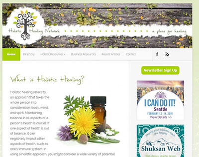 Typically, a website shouldn’t use more than three typefaces, as too many typefaces can start to make the website appear chaotic and confusing. If you want to use three typefaces, a good way to do so would be to use one for the content of your website, one for main headings, and another for subheadings. In order to guide the viewer through the content of your website, your body text, headings, and side information should all be separated visually. For example, headings could be much larger than body text, a different typeface, and/or color so there is no confusion about their role in the website. It’s also important to make sure your body text is legible for the web. The text should be large enough to easily read, and should have a decent line height so text doesn’t appear squished. Overall, your website’s typography should feel cohesive, but should also have a good amount of contrast and variation to guide the viewer through your website with ease.
Content
The quality of content on your website is very important, and can either be the reason that customers choose you or choose to go elsewhere. When writing content for your website, you should make sure to focus on your intended audience when deciding how to word things. The vocabulary, length of content on pages, and overall tone of your content all depend on your audience and what would be most suitable for them to read. Typically, you should try to be concise with your writing, keeping page length to a minimum while getting your point across effectively. However, if you are writing a blog article, or have a page on your website that requires a lot of detailed information, then this may not apply. In order to keep your viewers from losing interest in your content, you should break it into digestible sections on your pages. You can do so by using paragraphs, headings, and images to break up large amounts of text. You can also break up text by emphasizing important words, phrases, or calls to action (using variation in size, font weight, color, etc.). Website viewers will also be less likely to lose interest in your content if it focuses on how your company can benefit them, and not vice versa. Make sure to use important keywords related to your company and industry in your headings and body content as well, as this will make it easier for people to find your company’s website on search engines.
Overall Design
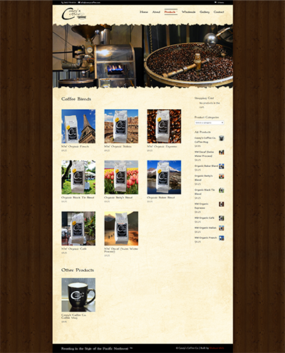 Although the design of websites varies greatly, there are a few guidelines any website can follow to ensure a more effective design. Your website should have a good amount of white space, meaning empty space where there are no images or content. To achieve this, your website’s content should have a fair amount of space around the perimeter of the content, as well as between paragraphs and sections. The website shouldn’t look cluttered, but should have space to flow visually. Another thing to consider is whether your website has design elements that repeat throughout the site to create cohesion. For example, your headings and body text could all be styled the same, or your website could contain symbols/icons that are all a similar style and color. You should avoid having too many design elements that are going to compete with one another, and try to keep the design simple and effective. However, images, icons, and other visual elements can create more visual excitement on your website, so you should include some visual elements without going overboard. Overall, your website’s design should be consistent, cohesive, and understated.
Conclusion
Your website may be the most important marketing tool at your disposal, so you should ensure that it is doing a good job of creating conversions for your business. By following the guidelines in this article, you will be well on your way to having a more effective website. If you would like a professional web designer to help you make improvements to your website, or need a new website built, feel free to contact us to discuss your needs.